architecture

Thoughts on Clothing + Shops in Copenhagen

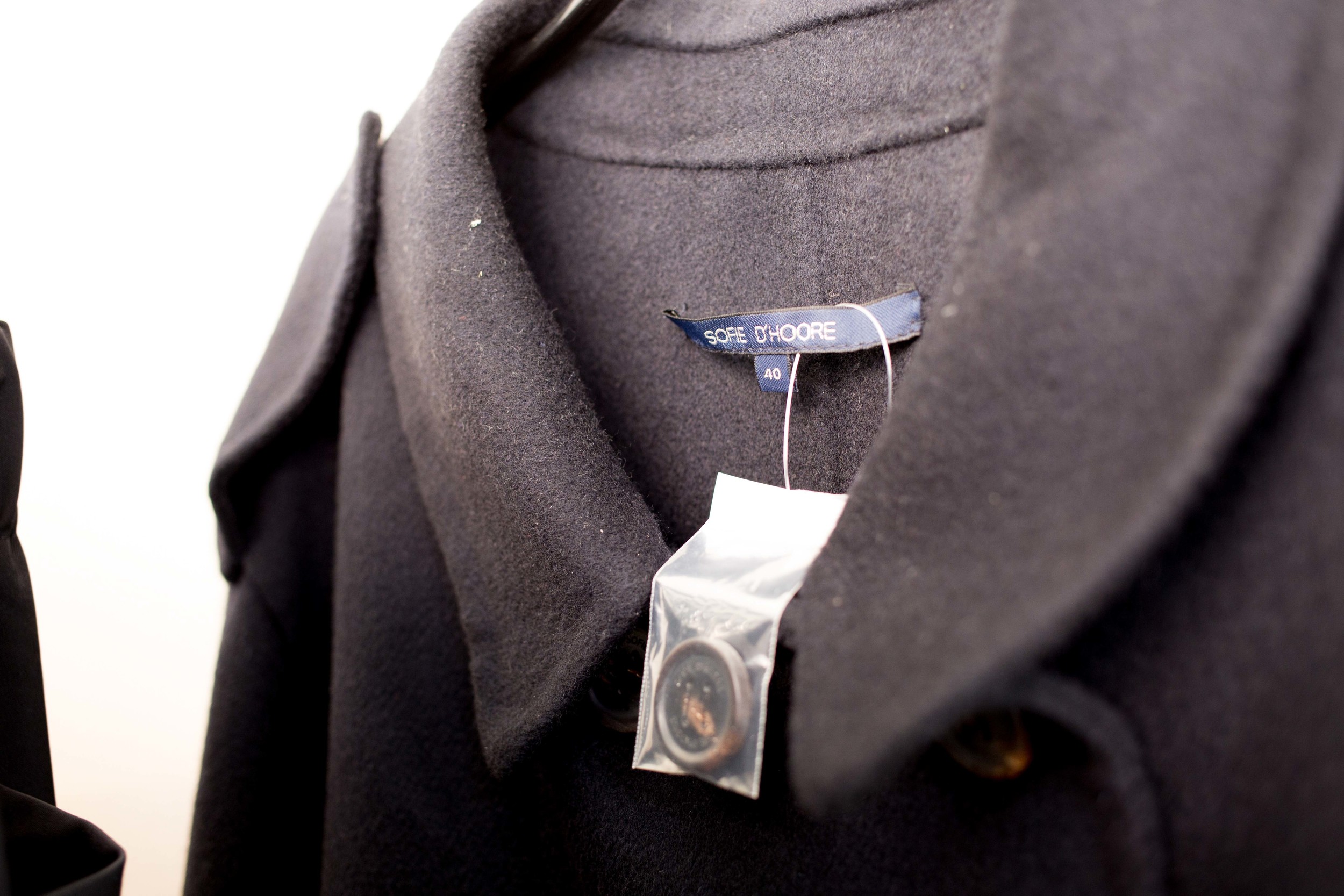
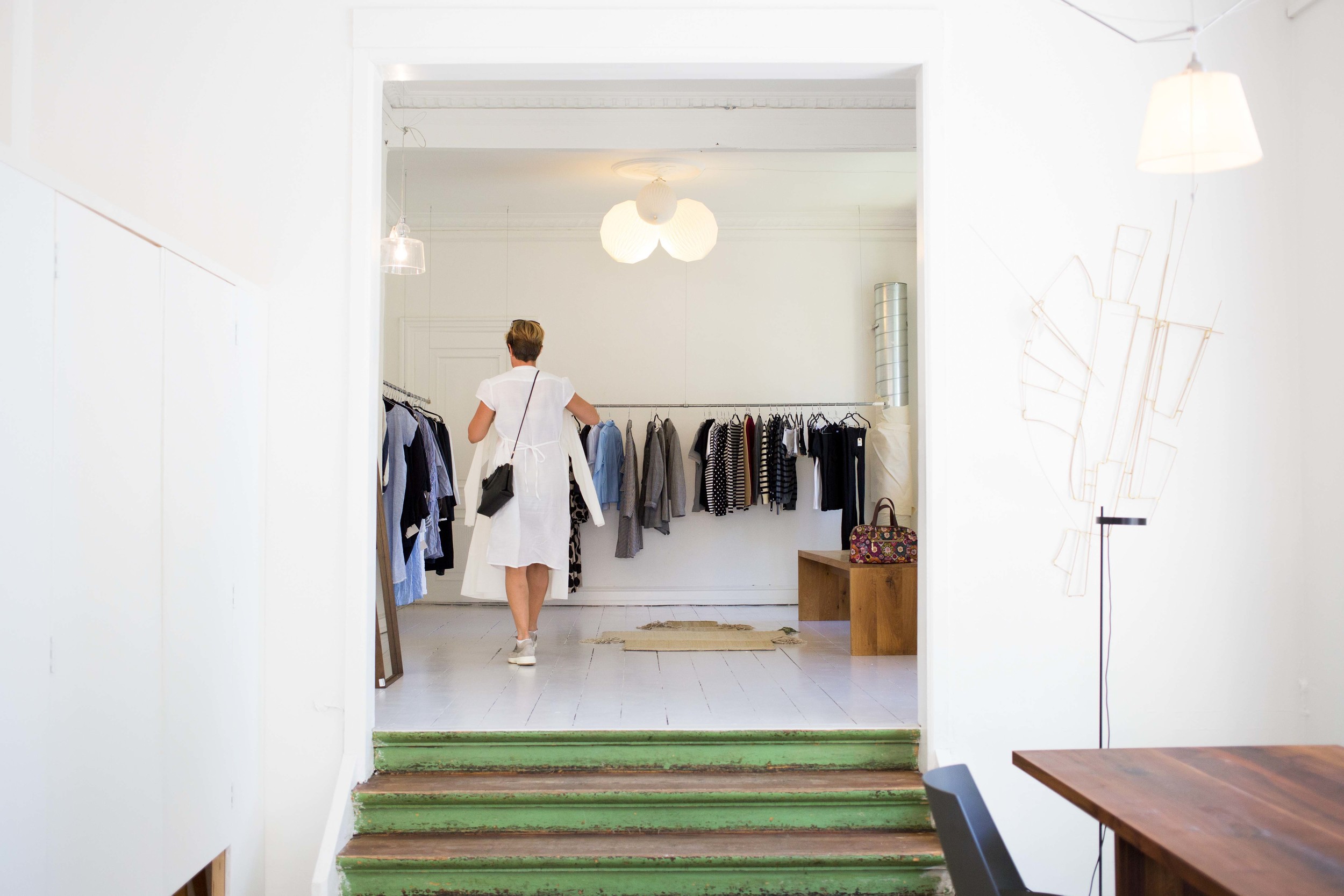
I haven't written much about shopping in Copenhagen but if you meet anyone who knows me, I am pretty infatuated with clothes. Having sewn some clothes for myself, I have learned to appreciate fabric, patterns, stitching, and just pure craftsmanship from designers who specialize in this field. I'm always looking for interesting cuts and I love finding material that consists of thoughtful quality while backed with intention.

I work in the technology field and there are moments where I think about digital product design as clothes making/design. Let me explain.

Parallels to clothes-making and technology:

1) Pattern makers are your back-end architects and developers. 
"What are you talking about?" you might ask. But have you ever met a pattern maker? These people are geniuses. Material is their data and they think about multiple things as they architect their plan to create various sizing for one style of clothing. Our human body is their ultimate goal but the production process is really what they are designing for and if they do it right, everyone else has what they need to finish the product. "Will this die cut be durable for the amount of production requested?" That question is not so different from, "Will this system be able to handle multiple queries and modular data flow?"

2) Sewers are your front-end developers. 
Sewing can get really technical. The type of stitch needed can make or break how something drapes onto your body (a component of interaction design). Some clothing designers have a fit over whether or not they should start on a half-stitch or a whole stitch - no joke. You pixel perfect people out there are not alone and your tribe extends far beyond the digital community. Our body sizes are the devices you code responsive design for and it matters how you organize your bootstrap logic in order to get the product to surface correctly. Coincidence? I think not. 

3) Clothing designers are your UX/UI folks. 
I have a fundamental belief that UX should not be separated from UI but I won't have enough space here to comment on that. I'll save that for later. Regardless, here is where the questions and design decisions get really tricky and again, not at all different from the fashion world. Is this relevant to what is currently out there on the market? Has this already been made? If not, what is out there that we can benchmark off of to make this product/dress better? Tell me more about how your foot feels while walking in this shoe. Do you feel confident that wearing this will keep you warm when walking outside during winter? Is this color palette configured to your personality/industry? And the list goes on.

I could keep going with this but an important point to make here is that it is imperative that clothing designers work with pattern makers and sewers constantly so that the end design is actually what was intended. This helps production flow to meet its potential and sewers know why starting at a half-stitch will actually change the product as well as influence how people interact with it when they put it on. So, the real question is, why do we separate these people in tech? Ideal teams all work together but I have seen many a time where back-end architects and developers don't even get to talk to UX/UI folks when assigned to a product. Or, front-end developers get left in the dark when handed screens to produce and have no idea how the product is suppose to behave and why.

I challenge technology teams to really explore other mediums to see how craftsmen are working to produce whatever thing that they are tasked with. There is much to learn from physical product making and I think that more teams should learn collaborative processes in other mediums. I'm pretty confident that if they do experience this, our digital products will be that much better. 


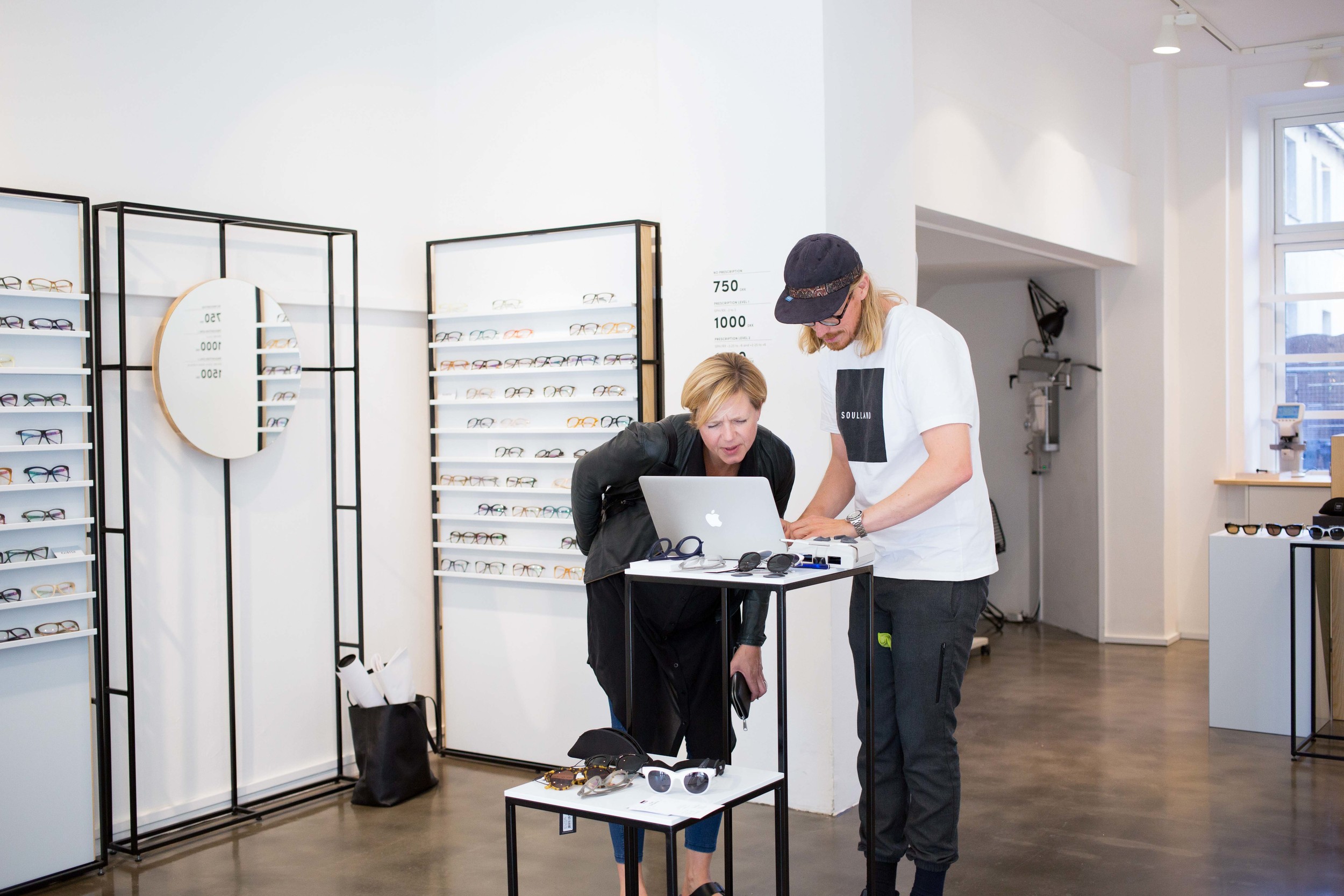
Enough of this though - take a look at some shops I visited. 

More Visual TREATS:

Type Hype

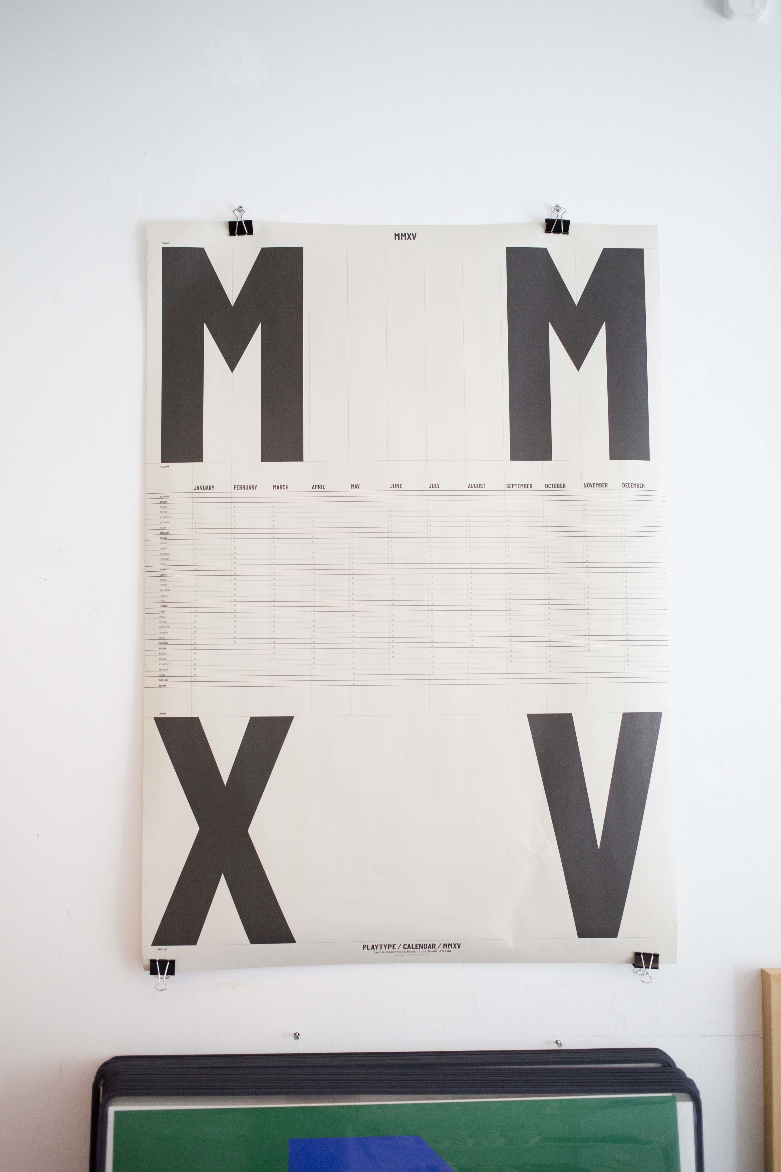
As a designer, there are so many things that you can gravitate towards and have a passion for within the design realm. For me, typography is and always will be one of my forefront passions when it comes to my design approach. So when I came upon this store called PLAYTYPE which is entirely conceptualized around typography, I nearly lost my cool. 

I can't even.... I just can't. So, I'll just show you photos.

I really wish I could bring one of these things home with me. Concrete lettering. How delightful.

Needless to say, I spent a lot of time here and talked to the girl who was running the store. She gave me some good tips on other fun things that are happening in the city as well as more places to eat. I'm also proud to say that I got a few posters to take home with me - not sure how that will happen when it comes to luggage but I am ready and willing to take the challenge.


More visual TREATS:

Black Diamond + A Neighboring DOME

I spent the day biking around the city and it's amazing what the bike culture is like here in Copenhagen. The order of importance goes: Bikes, People, and then Cars. Like Whoa. The rules are there and people follow - there's no question about it. It took a little while but I learned what all the hand signals meant and I was now part of the largest, bicycle driven transit city in the world. 

I wanted to read a bit so I went to the main library that housed a modern wing called the black diamond. 

The room where there is absolutely no talking or cell phones allowed. 

But the real beauty of the library is its modern wing. The architecture of this place is so thoughtful. It has a quiet confidence as it stands by the largest and most classically designed library in the city as if it is paying homage to the space while transitioning history and projecting it into the modern world. 

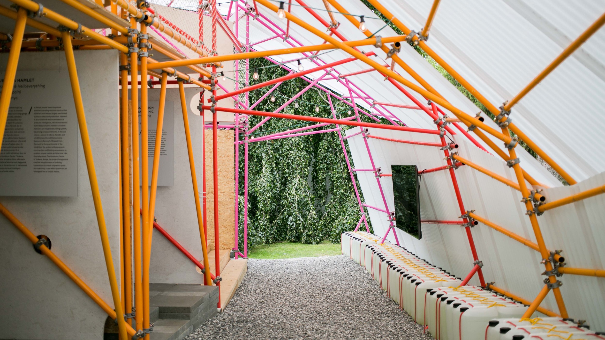
When you walk out of the library, there is an awkward area that needed some help. I remember thinking this from the last time I visited. In efforts to mediate this space, some architects designed and developed a dome that is unbelievably beautiful and wonderful. It has an energy that I can't describe and a peacefulness that transcends beyond what I could even imagine. 

These are some people hanging out and enjoying the day. That dog met me with love and because it was raining, the term 'wet dog' was fully realized.

The architecture in Denmark is quite remarkable and makes me question why the US is not as thoughtful when it comes to public space. I've seen a few places that are really well done but what if we all made an effort to do this? Would our country feel more thoughtful and inspired just by being surrounded and encouraged by great architecture? Would we live our daily lives with a bit more intention if encompassed by great urban design? I think so.


More Visual TREATS:

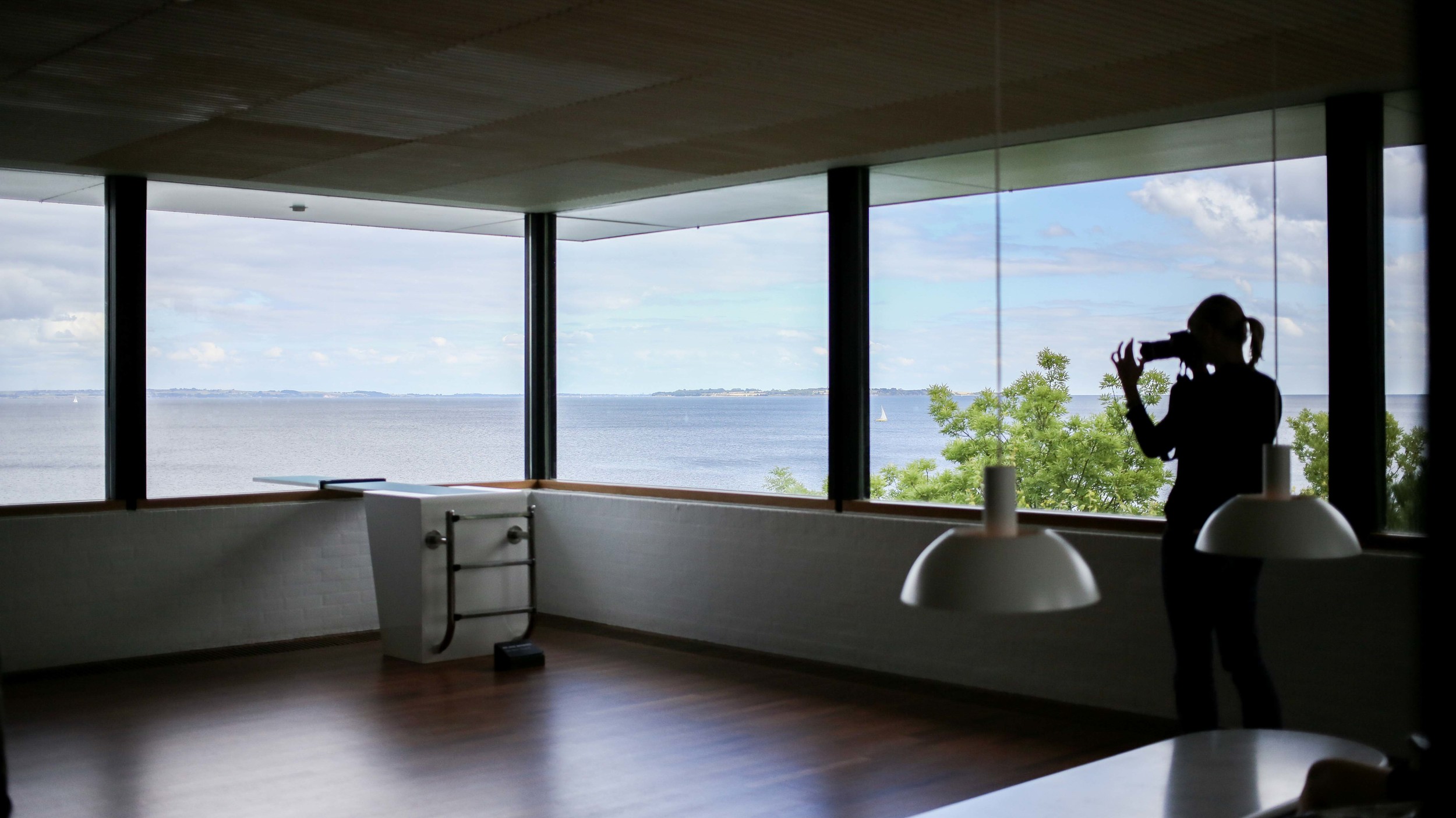
Louisiana Museum of Modern Art

Insight: Having no responsibility to answer to someone for at least 8 hours a day allows you to calibrate your compass to rediscover your truth north. 

I love art, design, and architecture. The letter I received from myself, sent by my high school english teacher 5 years after my senior year, told me that if I didn't have these things in my life, I needed to do something about it. It was this letter that led me to attend art school for my graduate studies and commit to a journey filled with perspective, discipline, conceptual thought, and craftsmanship. 

Throughout the years, I must admit that I became jaded with the endless politics and ladder climbing of the art world. The superficiality and unfiltered representation/celebration of presented work at various shows that was questionable at times created a spiraling negative lens of which I chose to respond with rejection and retraction. I lost my desire to see the treasures that exist in the pursuance of creating something with an idea/conversation in mind and for this realization, I have to thank The Louisiana Museum of Modern Art.

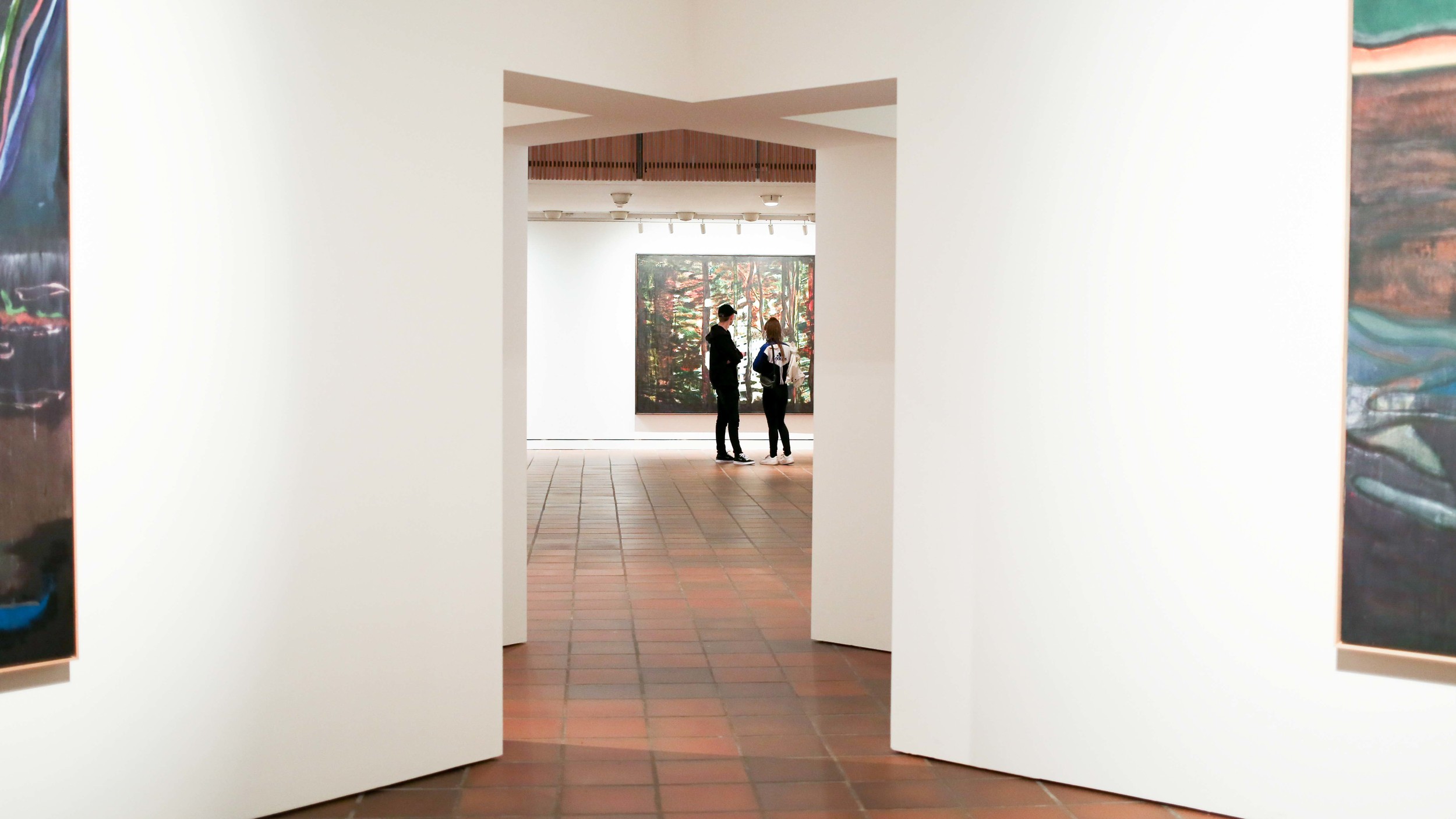
From its location and architecture build, this museum is a beautiful Mecca of carefully curated work that has a vast amount of people from all over the world traveling to experience its environment and all that it contains. I noticed the colorful array of people who I entered the museum with and I had the strangest feeling that I was at home. 'Home' is a word which its definition has constantly been morphing throughout my life - I still can't tell you what it fully means to me but I can tell you that it is the word I want to use to describe that moment.


During my graduate studies, one of the things that I had the chance to do was take a trip to New York with some professors in our painting department. It was winter and there were many galleries and museums planned for the trip but the most memorable space scheduled was the Dia:Beacon. The Louisiana Museum of Modern Art (LMMA) is not too different from how the Dia:Beacon is constructed. Here are the reasons why:

1. They both take a considerable amount of time and planning to visit

It is not an easy task to show up at both of these museums. What I mean by that is that it's not some place where you can pop in for an hour or two and then go shopping at H&M down the street when you feel you've had enough art for the day. There is a particular place and purpose for these kinds of museums as well but both Dia:Beacon and LMMA do not fall into that category. 

Why is this important?
By situating a place where the commute is specific and at least 40 minutes away from the hustle and bustle of a city does a few things. It prepares your mind and body for what you are about to encounter. There is something beautifully quiet about riding a train outside of a city and walking towards a space where you are about to be in close proximity to thoughtful work. By constructing a journey such as this, work that is going to be shown does not need to compete with other things that are vying for your attention. It forces you to be dedicated. To listen. To watch. To have a conversation with and about what is being shown. To be successful in what most art work is trying to nudge you to do: self-reflect on the subject matter at hand.

UX notes: By constructing an experience that is not as easily spoon-fed to someone, there is activity and intentionality to finding the goal you have to offer. Through this activity, there is already a sense of community in those who achieve this goal. In addition, during the research process, there is more information offered and time to be prepared with online content of what you are about to be rewarded with.


2. Distinct architecture defines your experience

My thesis dealt with a lot of architecture comments - mostly around the fact that you can design your workspace to achieve the goals you would like in your organization. I am not an architect but I am an interaction designer, and it is important to note that while interacting with things both digital and physical, your environment sets the tone and determines the potential of your experience.

Why is this important?
Your physical body is something that we aren't normally in tune with while we are experiencing something. Of course, when you are visiting a monument or sculptures that comment on your actual human size, you are aware of how you feel in that given moment but what I am eluding to are how our bodies subconsciously move about a space and what it prepares for while exploring content. 

While Dia:Beacon gives you its entire landscape so that you can prepare your entire visit, LMMA does something quite different. It suggests a hint of what you are about to experience, almost like a secret passageway, and takes you on a journey. I have to admit, I was a exhausted after the first few exhibitions because I was not prepared for how vastly large this space was but while putting into perspective the secrets that LMMA was trying to uncover based on its landscape, it was enjoyable in its intense exploration.

UX notes: There is a balance between how much you prepare a user for and how many secrets you can expose throughout someone's journey. It is important to use different methods to prepare someone for how much of a journey they will embark on and design it in a way that it does not exhaust the human from quitting altogether. 


3. The work is phenomenal and relevant

I commented earlier on the fact that I was tired of the art world showing things that were questionable at times. This is where curators shine. Just like any industry, an expert's responsibility is to know what currently exists, how the current culture defines what is relevant right now and projects the future to be, and what work has been crafted to communicate and comment seamlessly to both history and the current state of time. LMMA did not disappoint when it came to the work it chose to show and the exhibitions it created for visitors during the month of July 2015. 

Why is this important?
I believe that the art world's responsibility is not only to show relevant work that drives people to consider what it is happening in their current world but to also push into the future of where a certain medium can go. Without the knowledge of historical work done in a particular medium, there is the dangerous ability to create something that has already been done which could potentially be deemed as irrelevant. Celebrating work that has created an impact on industry mediums is a wonderful thing - and LMMA does just that.

UX notes: Just like painters, printers, sculptors, etc. do their homework in art history so that they can create something that comments on past artists while pushing the boundaries of their mediums, experience creators must do the same. Benchmarking off of other sites, apps, services, etc. is one of the best ways to push the UX industry into the future. Additionally, without a doubt, content is king in all contexts.


More Visual TREATS: