ux

Hey, Products. Mind Your Manners.

Image is from the movie, Marie Antoinette.

Image is from the movie, Marie Antoinette.

“Don’t put your elbows on the table.”
“Chew with your mouth closed.”
“Don’t interrupt someone when they’re speaking.”
“Say ‘Please’ and ‘Thank You.’”

Ugh. Manners. Raise your hand if you remember being groomed through your adolescence to recognize and mimic the behaviors of the world, to blend in, and do away with the very notion of being free and unbound to authority. I’m raising my hand if you can’t see it.

As an adult, manners are such a fine-tuned concept and they creep up on us in subtle ways. They are the blueprint of how social groups move around and also how people identify themselves (and determine their comfort levels with others). We don’t like to admit it, but if someone actively does something counter to what you were taught not to do, we become confused… and then uncomfortable. We don’t like to feel uncomfortable.

While we all like to say things like, “Be yourself!” or “You do you,” there are overarching human behaviors that fall in the range of feeling wrong, disrespectful, and impolite. Small gestures help us determine pretty quickly upon meeting someone whether or not they grew up around the same social rules, care about the same values about people in general, and if s/he is someone they would like to continue having additional social encounters with in the future. These are the small ways we define what is rude, what is acceptable, and what are gestures of kindness. This is the fabric of how friendships begin, relationships spark, and even how businesses create partnerships.

So, what does this mean for the digital world? Why should I care about digital manners when working on your project?

When we look at how products are built, how website UX flows operate, and how interaction designs behave, users eventually recognize whether or not they are being manipulated for good or for evil. They then determine what your main objective as a business is, and even farther down the line, decide whether or not they feel it is ethical to keep engaging with us.

As designers, we are no strangers to business folks dropping in and giving an ultimatum that money must be generated above anything else. We are also used to then proceeding to discuss what kind of “design” would make a client comfortable about their deal. To be clear, this is not fun for us but we do know that it is a necessary discussion. Designers will argue because of the holistic experience of what is at stake but also because, most of the time, the changes requested feel really aggressive and rude to put in front of users.

Let’s think about the everyday stories we hear when people meet/get together. The minor casualties of behavior that turn us off from continuing to interact with others can be analyzed to find parallels in the digital world to help us define and understand digital manners.


1) Put effort into your look. You should at least show that you came to impress.

If you do this:

GOES-example-2.png

People feel this:

cher-giphy.gif

There’s a reason why the fashion industry exists. No one is asking for haute couture on every screen but show that you care. It may sound shallow, but in 2019, it’s the name of the game. Find a designer, pay to get groomed, and be the attractive content you know you are.

2) Take ownership over your mistakes and look at it as an opportunity to gain some trust

If you do this:

yelp-example-4-1024x576.png

People feel this:

thumbs-up-giphy.gif

Hey – we’re not all perfect. We all make mistakes. But when you make a mistake, how will you respond? Will you be apologetic? Or defensive? Will you be honest and create dialogue while you work through your issue? From a relationship standpoint, this is foundational to future interactions so don’t avoid it. Set the stage and, hey, have fun with it.

3) Serve your customers the way you would want to be served

If you do this:

amazon-example-2-1024x632.png

People feel this:

nm-giphy.gif

I mean really. It’s insulting to expect that responsibility falls on one side if the stars aren’t aligning quite nicely. For example, if you’re out on a date and it doesn’t seem to be panning out the way you’d like it to, you would expect the other person to at least offer to pay dutch, no? This is no different.

4) Hire a copy editor, check your content, and don’t gaslight people

If you do this:

code-school-example-2-1024x352.png

People feel this:

obama-giphy.gif

The worst thing you could do to someone is make them feel crazy when they’re not. Coordinating promotions and timing advertisements will inevitably raise a lot of content alignment issues so make sure to tighten up what you want to say before you publish/deploy. When your content doesn’t align, it’s confusing and makes people question their sanity. Ultimately, you won’t achieve what you’re set out to achieve. QA QA QA.

5) Don’t be passive aggressive with your CTA’s

If you do this:

gmail-example-3-1024x638.png

People feel this:

pb-giphy.gif

This is all over the internet right now. It’s so frustrating for people to have to click on a CTA that is passively insulting. If you have a product that has sustained a longer user base and are continuing to evolve your product as time goes by, remember that you still have to be respectful throughout the relationship. Just because you and your user have been together for over 5 years doesn’t mean you can take that relationship for granted. Don’t take jabs as small as they may be. If you do it too much, the forgiveness can wear off and you could be looking at a deactivation.


Old habits die hard, and there’s always room for improvement and change, but the reality of it is that these small ways in which we interact with one another are the ways we keep our relationships going. It’s hard to grasp the idea of what it really means to design for humans, but we have found that thinking about interactions between machine and human as manners is a good start.


What other digital manners, good or bad, have you seen out there?


To get your team to start thinking about digital manners, try starting a slack channel like this and see what comes up.

Wonderfully Weird

Peter Ostrum with Gene Wilder in 1971 film, Willy Wonka and the Chocolate Factory. Photo Credit: Mirror.co.uk

Peter Ostrum with Gene Wilder in 1971 film, Willy Wonka and the Chocolate Factory. Photo Credit: Mirror.co.uk

I recently read an article written by James Victore about "The Undeniable Benefits of Being Weird," and it made me think about all of the times I felt so weird amongst my peers growing up. Have I suppressed this weirdness as an adult? Many times, yes. Have I released this weirdness without a care in the world throughout moments in my life? When I had the courage, absolutely.
 

That’s when others are inspired by your cause. That’s when you find those people, that audience, who accept you not because you’re weird or different, but for whom you really are. You create the potential for shared humanity, and allow others to see their struggle reflected in yours. Ultimately you hear that glorious refrain; “Oh, you’re weird? I thought I was the only one!” This is how businesses are formed. This is how relationships are formed. This is how you find your people.
- James Victore


This paragraph is truth. I have a story to prove that it is.

At my previous job, I was required to use the software product, Trello. Ugh... I hated it. I was the only one on my team who hated it. They pointed and giggled at me every time I rolled my eyes while using the product that "we, as a team," decided to use to manage our projects. Just thinking about it makes me twitch. When it came to Trello, I was weird - and I thought I was the only one. 

Until... [Pause Button] I wrote previously about the Service Design Conference I attended a few months ago and I mention this because this is where the Trello hater meet the other Trello hater. [Ok, Play Button]... I met Erik Flowers. This is how the meet cute played out:
 

Erik: "Service Design [blah, blah, blah]... ugh, I hate Trello."
Me: [gasp]
Erik: [head turns towards me because my gasp was so loud]
Me: "Omg... seriously? I hate Trello! I thought I was the only one who hated Trello!"
Erik: "HA"


Like James Victore stated, I had found another one of 'my people' in this one connection of weirdness. I made a new friend to be weird with and oh man, has it been an adventure. 😱

This is Erik at Blue Bottle Coffee in Palo Alto, CA where we hung out and got to tell each other our stories.

I was in NorCal about a month ago and was able to schedule some time with Erik. He wanted to meet at Blue Bottle Coffee because of a specific waffle that they sell. When he told me this, I thought, "Whoa. That's exactly what I do. Go to destinations with delicious food I've been craving... he is SO cool." It made me wonder if there was anything else we had in common.

It turns out that the list of similarities runs quite long - to the point where both of us were sort of shocked at what we were both pursuing in the near future. We had similar backgrounds of studies, philosophically aligned when it came to topics like "theoretical design," and his humor was on par with the many comedians I appreciate. I couldn't believe it. The universe is so weird.

Erik has since become a good friend of mine and has also encouraged me to make this blog public and available to the internet. (If you're liking this blog, thank Erik! Check out his blog too - great topics executed with pristine writing.) He recently spoke at the Service Design Conference that took place in SF a few weeks ago, launched a website called Practical Service Design with Megan Miller, and is pretty much taking the Service Design world by storm. 

It's important to have a support system around you and to also be a support system towards others - this is survival at its most basic definition. I'm looking forward to seeing more great things from Erik as time goes on. I'm also looking forward to his thoughts on the things I produce in the near future. I wondered today what would've happened if I didn't expose my weirdness about Trello. I deleted that thought and replaced it with a 'thank you' to the awful Trello for bringing Erik into my life.

So, I encourage you to release your weird. You will find your people this way and feel human connections you very well may have missed but oh so deeply need in your life. Who would've thought that being a Trello hating weirdo would serendipitously bring a wonderful friendship into my life? Even that thought is just so wonderfully weird.


(A note about the waffle: Right when we got to the counter, they said they stopped serving food 5 minutes before we got there. Hearts were broken. We will return.)

UX/Service Design Notes: Putting wonderfully weird quirks into your product/service can create extended human connections based on what certain people find enjoyable and memorable. When people get together to share their experiences, products and services are often on the top of the list. If you want to create excitement and have a competitive edge over others, add a little weirdness to the mix - it's like free marketing.


Dunne + Raby

Photo from Dunne & Raby's Technological Dreams Series: No. 1, Robots, 2007

Photo from Dunne & Raby's Technological Dreams Series: No. 1, Robots, 2007

The pathway to becoming a UX designer and/or Service Designer is always a fascinating story. If you take the time to ask fellow professionals in the field of how they came to be, I guarantee that it will be time well spent. The beauty of this industry is the fact that people have diverse backgrounds from probably every field you can imagine. This is why I love the HCD world.

Another reason why I love the HCD world is because if you look for it, you can pretty much find it in any field that exists. And when you do, the people you meet have no idea that they are actually participating in a HCD-like manner. 

One of the places that I found Human Centered Design is in the conceptual design world. Take for instance the subject of 'Critical Design'.

Critical Design uses critical theory to approach designed objects in order to challenge designers and audiences to think differently and critically about objects, their everyday use, and the environments that surround them. Many design professors teach this way of thinking with their design students who are producing highly conceptual artwork within the design realm. Are you still interested? I'll keep going.

I'd like to introduce you to a duo who teach as design professors in London and Vienna and make projects stemmed from Critical Design. Their names are Anthony Dunne and Fiona Raby.

Another photo from the same series.

Another photo from the same series.

'Their work has been exhibited at MoMA, NYC, the Pompidou Centre, Paris, and the Design Museum in London, and is in the permanent collections of MoMA, the Victoria and Albert Museum, Frac Ile-de-France, Fnac and the MAK as well as several private collections. [...] In 2015, Dunne & Raby received the first MIT Media Lab Award.' I don't think that I have to justify their impact within the design world - they are well respected and consistently referred to when new work is presented to the world.

Techies - listen up.

Although the list of work they have produced is quite long, I'd like to bring attention to one of their projects called, "Technological Dreams Series: No. 1, Robots," created in 2007, which is a great example of Critical Design. It provokes the idea that ‘one day, in the future, robots will do everything for us’ and the question of how we will interact with them comes to the surface. In this project, designed robots are shown to project the ‘new interdependencies and relationships [that] might emerge in relation to different levels of robot intelligence and capability.’ (Dunne & Raby, Project Info)

I am a firm believer that it is though works like Technological Dream Series: No. 1, Critical Design ultimately takes on the role of questioning ‘the limited range of emotional and psychological experiences offered through [existing] designed products.’ (Dunne & Raby, Project Info) It emphasizes the condition of today's design culture as it ‘limits and prevents [designers] from fully engaging with and designing for the complexities of human nature.’ Although this can be seen as a negative way to view designed objects, Critical Design ‘is more about the positive use of negativity’ as it confronts designers to think critically about people they are designing for. This theory supports HCD through this confrontation and many designers have, since then, turned to HCD for guidance.

How wonderful, right? And very appropriate for our HCD/UX/Service Design field.

If you have time, watch and read about the robots. Think about what a world would be like in the future if robots and technology actually behaved in this way. I challenge you to consider why we are in partaking in this industry and to think about what ways you can use this fictional narrative to make what you are currently making more human and healthy for today's world while keeping the future in mind. If we don't start now, we could very well be living in a world where technology dictates our behaviors and way of life rather than allowing our human culture to grow organically while technology serves and evolves with us.

Design-tervention

Have you ever had a friend-tervention? When your friends stage an intervention regarding something in your life because they know you need it?

I've had several done by those who love me and I've also been part of a few acts of the kind towards the people in my life I care about. At times, it is quite necessary but sometimes, looking back, I think that some of them could have been constructed better in its delivery. A few of them, when evaluating with a bigger picture in mind, most definitely could have just used patience in knowing that the loved one will get there eventually and absolutely needs to get there on their own. Hurt feelings aren't the best way to pursue interventions and during my college and early 20's, my naivety rushed critical understandings that perhaps one was not ready for - I also feel the same way about several things that were thrown in my direction when I wasn't ready for it.

Human Centered Design isn't any different. A lot of times, it is actually, in fact, an intervention. When you're reconsidering a project, putting it on hold to perhaps insert a HCD process, or even when you're reevaluating something that has been done from an HCD lens, you are intervening on behalf of humans. This is a good thing, in theory, but delivery is key. What that delivery consists of is perhaps the greatest piece of the puzzle when designing anything. Designers must know this criticality within the process. 

I'd like to share an intervention that is happening to me during this design residency I am taking part of for two weeks.

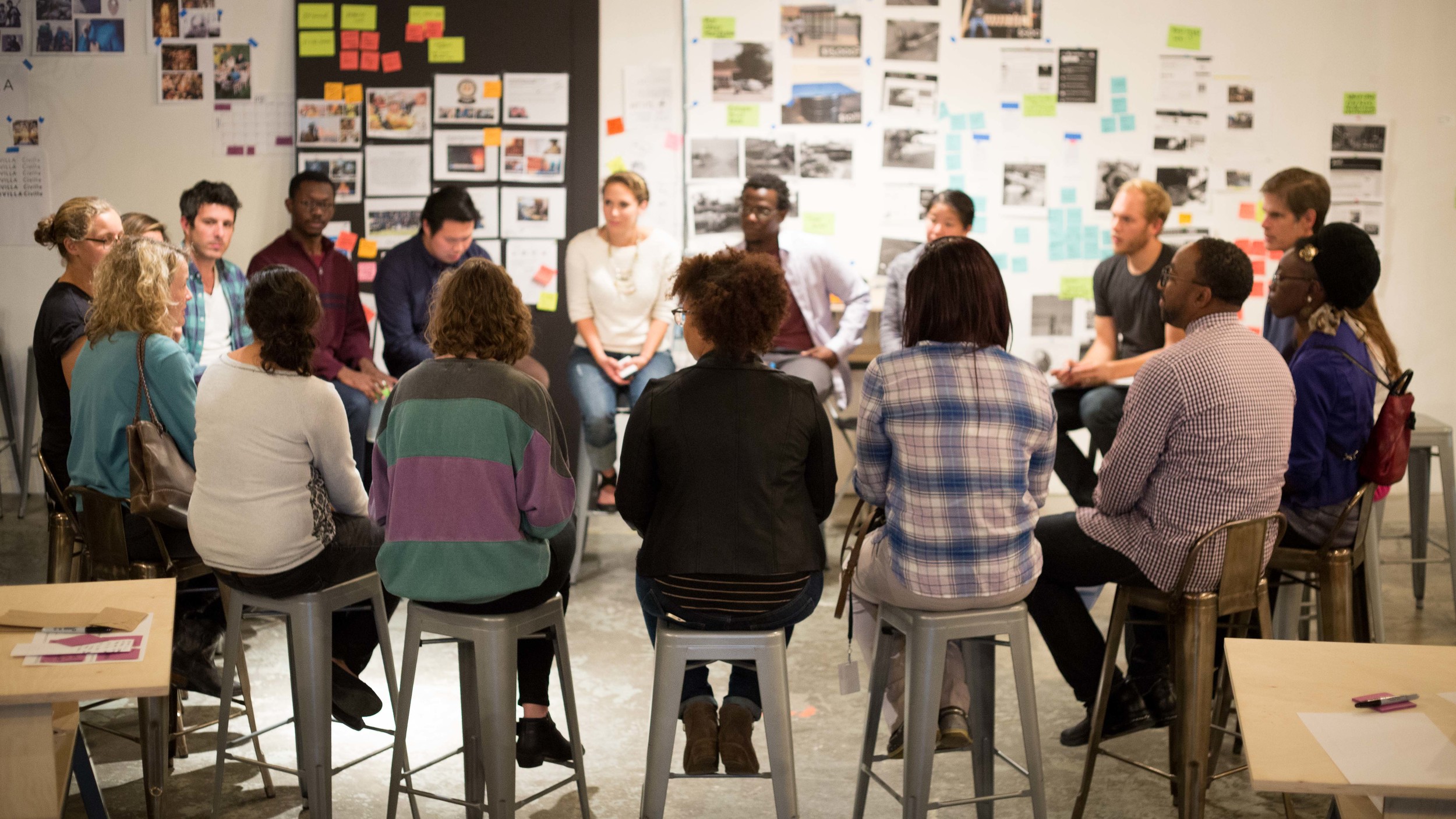
A Civilla class that begins and ends with a circle of community and expression of thoughts.

A Civilla class that begins and ends with a circle of community and expression of thoughts.

In my past work environment, I will share that it was a bit toxic in the context of management personalities, as well as general advocacy for design as a professional skill. I won't go into detail about specific stories and people, but just know this - it was not healthy for me to be in that environment anymore and I had to pull myself out of it. (This is a great reason to take a sabbatical if you are kicking around the idea. Take a step back and reevaluate who you are in your work environment. If you don't like it, maybe it's time for you to take a step back and recalibrate your compass.)

What I will share, though, are the behaviors that were drawn out of me by putting myself through an environment in which I thought I could handle. To name a few, the following are things that came to surface: Actions that were opposite from 'Shine Theory' with my fellow women workers; Political insecurity which manifested itself by speaking downward towards those who I felt threatened by; Insecurity in the credit and value of my work; and a wretched habit of name dropping just to level up to those in the room.

It was terrible. I was terrible. 

Another goal that I added to my list during this sabbatical is to regain who I am as I despised who I was becoming in a work setting. I am not perfect and I will be the first to say that I am absolutely responsible for these actions because they are mine, but I do know myself and I know that within my beliefs regarding what is right and what is good, it doesn't include any of the above actions. It hurt my heart to know that I had evolved into a person I promised I wouldn't be. So, I put an end to it.

I'm not saying that you shouldn't be smart in how you navigate work culture. You must learn the way the machine works and move through it in your most sincere, truthful, and kindest manner. You must know and master the system so that you don't let it push you around.

Environments and their surrounding cultures are critical to the kinds of people organizations will produce if constructed a certain way. We are always growing as people and when you're young, you're kind of a flaring firework that is just waiting to explode into the air to be recognized as a shining, talented creature. If you deny this, you are lying to yourself. Work culture in America is constructed this way and if you are trying to survive for the many reasons you have on your priority list, all humans behave in this way. Darwin is absolutely right in this context - it is the survival of the fittest.

But, what happens when the ones who make it to the top are monsters? Well, they produce fellow monsters, of course. And what happens when the ones at the top are gentle, kind but firm leaders? They produce fellow gentle, kind but firm people.

I share these thoughts because I have met wonderful leaders during this design residency and I have experienced, again, what it means to be led in a thoughtful manner. It has given me hope for myself that I am actually not this way in work groups when respect and encouragement are foundations for a working culture. I am relieved to know that I am not a monster in the working world and have more confidence in myself and my work than I ever did in the past. This all happened in 1 week.

I'm proud to be a member of Civilla's family. 

I sit in my temporary home in Detroit and think about how miraculous this experience is. The story of how I got here and who I have met is nothing short of a miracle. What I am learning right now, I will never give up for the world. Never have I ever met such beautiful souls with whom I have immediately connected with and wondered, "Why am I meeting these people now? What took so long? What is happening right now?!" 

For starters, Civilla is a social impact/innovation startup that began in Detroit at the beginning of September 2015 (that's last month). This little group has one of the biggest hearts within the range of startups I have consulted with, and the projects they are pursuing are a testament to that fact. Passion is the project. Social intervention is the evolving experiment. 

Civilla has taken a repurposed storage closet as their first home. A great transformation indeed.

Civilla has taken a repurposed storage closet as their first home. A great transformation indeed.

Although Civilla is intervening on behalf of the people of Detroit using the HCD method, I am proud to say that they have intervened in my life as a beacon for knowing what exact environment and culture makes me feel safe and confident when it comes to work. I can only attempt to describe the joy I feel of knowing this truth. Perhaps using a food analogy will help. I feel as though I have tasted the simple, yet delightfully thoughtful bowl of porridge that is ever so slight in its first impression but immersed with enriching ingredients that slowly expose themselves bite by bite - teaching you the roots of what food and taste should be while humble in its packaging and delivery. Better? I hope so. I need you to understand this.

From left to right: Lena Selzer, Adam Selzer, and Michael Brennan

From left to right: Lena Selzer, Adam Selzer, and Michael Brennan

There is nothing about this experience that I expected in my lifetime, but I will wholeheartedly accept it and appreciate, in utter awe, the fact that it is happening. The universe is beautifully mysterious like that - I often wondered what would actually come out of my sabbatical but this journey has proved to be filled with more than just rest and goal seeking. Or could it be that through the pursuance of rest and goal seeking that the things that must open our eyes actually come to fruition? At this point, however way you want to look at it, I'm just glad it's happening. 

UX Notes: We are what we experience and our experiences will guide our future decisions and paths. If you are enjoying your current experience in your workplace, bravo. Continue with that experience but don't forget to challenge yourself so that you will grow. If you aren't enjoying your experience in your workplace, I challenge to seek out why that is. Was it the 'Login' process with HR that exhausted you right from the beginning? Or was it the enticing interactions you fell in love with during your interview and when the curtain was unveiled, you saw the reality of what you signed up for? Think about it.


Amtrak Customer Service and UX

Remember that magical conversation I referred to in my last post? Well, turns out that stars have aligned and something in the universe has been preparing me to go to Detroit. 

Am I excited? I'm trying to keep my cool... but I think it's going to be pretty rad. !!

The thing about this is that I don't know what to expect... but I do know this - I believe in my heart that the people there are great and that we believe in the power of Human Centered Design. So, let's do this. 

However, sometimes when the universe aligns perfectly for someone else, things are breaking apart for others. It's strange how life works like that but this has happened to me before. Actually, when I know things are about to be great and everything just seems to be going right for me, there's a part of me that begins to reserve space in my heart and mind for sadness. It's almost like metaphysics. You can't control it.

This time around, a really good friend of mine was the one to break some awful news to me about something in her life. I get so upset when bad things happen to good people. I just... I just can't. 


Amtrak's 1971 logo.

Amtrak's 1971 logo.

This is all to say that because of recent events such as those mentioned above, I found myself having to purchase an Amtrak ticket for my trip to Detroit. The website was confusing (UX Alert!) and their guest reward thing is separate?? Actually, it was so bad that I decided to call. Yes. I opted for calling someone on the phone to talk to a human. I didn't see any 'chat now' buttons and my password wasn't being sent to me after I reset it so I figured I had to. 

I had the best customer service that I have received over the phone in probably my entire life.

Even better than Chase Sapphire Preferred Card. 

She was kind, efficient, offered to do things for me when she didn't have to, and even asked about things I hadn't thought of regarding my trip. She also knew the order in which my mind was processing all of this information and it seemed like she had it down to a science. It was great UX. 

I think old systems like train/railroads have a great customer service embedded into their phone culture because that was the UX of their time. The hottest new thing was the telephone and businesses competed with each other by trying to offer the best services via operator. It's fascinating how often history repeats itself in different ways. The answers to things are usually already there - you just have to readjust the solution and reapply it to the context at hand in a mindful manner.

What I loved about the entire experience though was how much she made me feel at ease with the confusion of what I was seeing on screen. She explained why changes weren't showing up and assured me that my information was being updated as she typed. The secret to her miracle UX work was being able to mix both phone services and web delivery all at the same time - she made a believer out of me. 

So, I guess the phone isn't dead. I'll definitely remember this experience and take a chance on calling if everything else fails. I won't start to expect great phone service though - I think companies still need to desperately straighten that out. 

If there are any UXers who would like to tackle the Amtrak system - it would be a good idea to hang out with these phone service operators. They just might be able to write the whole architecture out for you.  
 

UX Notes: When Macy's made the decision to have their operators help direct customers to other stores to find what they needed, this was a UX decision that worked in their favor. They did this all by phone. What if our department store online checkouts also searched and crawled other stores' websites and directed their customers with a link to purchase their goods there if they were in the same situation? I guarantee loyalty.

Unexpected Kindness + Opportunities

Update: I have not yet gone back to a full-time job. I decided that 2 full months was not enough time for my mini-sabbatical and that I needed a bit more time. I have chosen to design my life in this way right now and we shall see what comes from it. I will write a full post when I take my next steps.

Pictured here are Jen and Jo from Starshaped Press. Two people who are very near and dear to me and who have been incredible encouragers and friends.

Pictured here are Jen and Jo from Starshaped Press. Two people who are very near and dear to me and who have been incredible encouragers and friends.

This decision, magically, has done wonders for me so far and I have met, been introduced to, and created many new personal and professional relationships that I probably would not have encountered had I taken on full-time work instead. 

What I have realized through the meeting of these new folks, especially those in my field, is that I am beginning to see glimmers of hope in the context of possibilities again. I have to confess that in the past few years, I was a bit nervous and unsure about where our industry was headed. My thoughts included:
 

"Where is this going? Is it working? How can we make this better? Will this even make a difference? Why do certain groups just not care? Do I still care?"  


What I failed to realize is that I didn't have a strong network of supporters/encouragers in my field, outside of first degree work connections, that I could lean on when times were tough. I can absolutely say that building this for myself right now is a lesson learned and what I hope is not regrettably too late. 

I have met a lot of people even in these past few weeks and something that I have thoroughly enjoyed experiencing and deeply appreciate from the bottom of my heart is just genuine kindness and encouragement. I know that not all folks are like this but when you do get to encounter these moments, your faith in the world sort of restores itself bit by bit and it gives you enough oxygen to keep trying. I really do believe that the universe has its own way of supporting you when you least expect it and what I love about it is that you never know what shape or form it will arrive in.

This is all to say that these relationships have led me to an unexpected opportunity that is really exciting. I'm really hoping the stars align on this one. 

I have to write this: There is something about this opportunity that feels different. I can't quite put my finger on it but it feels sort of like real magic. Stay tuned.

Anyway, I am thankful for my community and it spurs me to offer encouragement towards others who may need it more than me. Feeling down on UX? Hang out with your UX community and I guarantee you will feel better.

A UX Lesson in Baby Carrots

Baby Carrots are not actually babies in their Carrot families. They are adults that didn't make the 'good looking club' only to be cut down and shaved into something that doesn't even exist naturally IRL. 

I discovered this fact a few years ago and I think about it from time to time. When I pass by a bag of 'baby carrots,' my heart sinks and I spend about 7 seconds thinking about what their true expressions of form would've been before being tossed into the 'not good enough' corner and then forced to take the same shape as the rest of their fellow rebels. I still always buy a bag to snack on later. Nom nom.

I've been cooking a lot more lately and have actually had to purchase real, adult carrots for recipes. When I meet them in their stacks at the market, they seem so boring. They're all straight, tall, some are chunkier than others, but there's no variety to what I'm looking at and on top of all this, they're dirty and need to be peeled. Ain't nobody got time for that. What's so special about these ones anyway?

Every now and then I'll meet one with a little flair of character that has snuck into a pile on display for the world to see. I tell it, "Show'em who's boss you badass carrot." When I go to the farmer's market, I see the ones who had so much fun in the soil that it's a miracle the gardeners even knew to categorize them as carrots. (Apparently, carrots can throw raging parties where they wrap around each other and end up looking like corkscrews. Party animals.)

Google search of 'carrots twisted.'

Google search of 'carrots twisted.'

However, when I started to use carrots in my cooking, I as a user of carrots began to appreciate the reliability of the straight and uptight, boring carrots. They were easy to peel and chop, tasted richer in flavor, and according to The Carrot Museum, they are richer in nutrients when they mature the way they are supposed to mature. 

What I'd like to point out here is not that there is a Carrot Museum in this world (what?!), but that as designers in the UX world, sometimes it is best to leave certain components alone. If they are reliable, simple, and satisfying, focus on another aspect that actually needs some change and help. Use your reliable, simple, and satisfying feature to gain trust from your user and anchor your extended experimentations on the foundations of what works and what will, more likely than not, always work. Use it as the stable ingredient in your larger recipe for service delivery and/or digital feature.

As an artist and designer, I like to change things up. A new way of doing things brings fresh perspectives and intentional awareness is heightened when engaging in a novel interaction. You can spice things up every now and then just to keep the user engaged but remember that your experience, as fancy as it can be, will always be an ingredient to a human's larger soup of encounters s/he experiences every day. 
It's hard not to make your UX/Service design shine brightly to stand out from the crowd but I think there is something to be said about being the same, boring yet reliable service available for people. No nonsense. Just a basic and nutritious ingredient to a user's journey throughout his/her day.

Steadiness is a virtue. Perhaps 'baby carrots' would agree.

Shine Theory

While I was tidying up my place for a week using the KonMari Method (you can read about it in this blog post), I harnessed my boredom moments by listening intently to podcasts throughout my activities. I had a lot to catch up on since I was so busy the first half of this year so I had plenty on my queue. 

I finished all of it. 27 Radio Lab episodes, 13 This American Life sessions, and 11 Stuff You Should Know blurbs. IKR? Counting all of that makes me feel like I overdosed in one way or another but it feels good to be 'caught up' on the stations I subscribe to. I was now up to date.

But then the terror swept in. I wasn't done tidying and needed another podcast to listen to. Marie Kondo, the author of the book I was using to tidy my apartment, forbid me from watching TV episodes throughout the process so I was panicking even more. I googled, sampled, and even tried out some of Apple's podcast Top Charts list as well as their Featured list. My heart was into nothing. I took a pause from tidying and even went for a walk while testing out some more podcasts. 

And then I took a chance on CYR: Call Your Girlfriend. Two long distance besties who met in Washington, D.C., live in different cities, and take time to talk to each other once a week on all things politics, Beyonce, feminism, current events, technology, and so much more. After listening to their pilot episode, their voices and reasoning over debatable opinions became addictive and oh so refreshing. If you have not yet listened to this podcast, especially if you are a lady, I guarantee you will love it. Well, I suppose it depends on where you fall on a spectrum of topics, but if you have any respect for women in our generation and workplace, you will gladly find yourself saying, "This is true. I agree." or "Wow. I never thought about it like that." throughout the episodes.

These girls have it. I don't even know exactly what it is but I feel as though that they understand what it means to talk about topics that are ever evolving - especially the hard ones that deal with feminism and every perception that exists when the delivery of a political message/opinion is unsuccessful or successful. They're funny, smart, and incredibly sharp as they articulate their thoughts throughout each episode. Their agendas are also sprinkled with lots of pop culture which keeps things interesting and entertaining. Any podcast that can talk about Ruth Bader Ginsburg (a.k.a. the Notorious RBG) and then riff on Kanye and his artistic troubles will always have my ear. 

The greatest reason why this podcast should go down in the history books is because they have introduced Shine Theory to the world.

So, what is it? It's this simple.

"I don't shine if you don't shine."


Although this applies to a lot of situations, genders, and identities, this theory is spoken directly to women in the workplace. I will be the first to say that we have desperately needed it.

Personally, this has opened my eyes and committed my heart to pursue remembering and acting on this theory throughout everything I do, but I am so glad that it is aimed at the context of us ladies while we work. I have seen countless amount of times where women have done the opposite - almost as if they were saying, "If I don't get it, then you can't either. Over my dead body." I have worked with and known women who think this way and it is exhausting. It's also really easy to absorb this misery and become the perpetrator of the same kind of actions - misery loves company and revenge is sweet for a reason.
 

But even if it were somehow possible to objectively evaluate all of our female peers against ourselves, it’s worth asking why we’re spending all this time creating a ranking system in our minds. When we hate on women who we perceive to be more “together” than we are, we’re really just expressing the negative feelings we have about our own careers, or bodies, or relationships.

Here’s my solution: When you meet a woman who is intimidatingly witty, stylish, beautiful, and professionally accomplished, befriend her. Surrounding yourself with the best people doesn’t make you look worse by comparison. It makes you better.

- Ann Friedman, Call Your Girlfriend: Thesis


What I love about this theory is the fact that not only is it absolutely true (proof is in the plethora of other theories that are along the same lines but aimed at different contexts), it's the first time that there is actually a thoughtful theory by and for women to help other women direct their behavior in a positive way. When something is theorized and solidified as an actual thing to philosophically take into consideration, it pulses in its radar and beeps until it is acknowledged and either agreed to or rejected. It also helps that Taylor Swift's squad goals are heavily marketing this theory IRL. 
 

why

because true confidence is infectious

because powerful women make the greatest friends

because people know you by the company you keep

because we want the strongest, happiest, smartest women in our corner


- Call Your Girlfriend: Why


I guess all I can say is THANK YOU Ann Friedman and Aminatou Sow. You have both created a platform for ladies to choose to be a part of and identify with which is more than comforting. 
 

UX Notes: Although Shine Theory is used mainly for women in the workplace, the reason why it exists at all is primarily because women in the workplace are a minority population that is struggling to find a voice and seeking to appropriately navigate its growth for years to come. The UX discipline is new and also a minority population in a lot of contexts - especially in large corporations and places where the word 'design' is still cringe worthy. As much as we want our UX discipline to solidify itself, have a backbone, and be the answer to the very many problems that exist out there (because it is that great!), let's partner with those who think of us as rivals and use Shine Theory towards them. More likely than not, they are probably Outsider UX folks and you may find that you have more in common than you think.

Service Design Conference // Chicago 2015

The topic of service design has come up the past couple of years and I find it fascinating how quickly these two words are gaining popularity and acceptance in even the largest of institutions. UX was, and still is, not as generously accepted when introduced and I have a theory about why this may be the case.

My theory is that because the word, 'Service,' has humble connotations and is cognitively associated with actions related to hospitality, food industry, and depending on what kind of service you've ever received, it is generally accompanied with kindness and a smile. This word is also viscerally more accepted as something to consider and be curious enough to look into when mentioned. It is non-threatening in its introduction across many contexts and specifically in political contexts, it can also be quite powerful as it subtly comments on working class labor and ethics. It kind of just slides right into our vocabulary and this ability is not to be taken lightly.
 

Service Design Panel discussion at the end of day 1.

Service Design Panel discussion at the end of day 1.

Let's take a step back and compare 'User Experience' and 'Service Design.'

Some argue that they are different, some say that they are from the same family, and some just don't even know what to do about either of them. This is partly due to our industry's lack of firm definitions at times which allows it to be more inclusive to newcomers and gives room for more creative ideas but this is also destructive in our current business landscape because we don't look put together and decided.

From a larger HCD perspective, the principles and philosophy behind who you are designing for is one and the same. Both are pursuing the goal for a better user/customer/human experience. However, the beauty and revelation of this split that will inevitably grow and be more definite in the future is that it streamlines and organizes new design ideas and improves production flow to look more holistically at the human rather than quick fix moments. Not to say that this isn't being done in several UX circles right now, but I guarantee those UX circles can be draining at times while tethering between different hats that are undefined and nebulous.

The best way that I can explain this is through something I learned in my college anthropology studies. In anthropology, there is a separation/distinction between a person's status and the roles they take on within that status. People can have different statuses throughout the day but each has a set of roles that the human knows to act upon while assuming that particular status. This is why elevators are interesting because there is no set status or role - awwwwkkkkwaaarrrddd. 

Examples:
When I get into my car, I have the status as a driver. As a driver on this particular day, I must pay attention to the road and push the gas + brake pedals while obeying traffic rules until I get to my destination. Those are my roles while I take on this status. 

When I get into my partner's car, I take on the statuses as the navigator and passenger seat companion. As the navigator, my role is to look on my phone and use my vocal chords in an audible fashion to tell my partner what turns s/he needs to make to get to our destination. As a passenger seat companion, my role is to also play music that is appealing to both my partner and me. 

So, why do I bring this up? Statuses and roles are innately how humans move about their lives - both physically and emotionally. We need this distinction and acknowledgement in order to better our industries and tribes. I believe that to some degree, 'Service Design' comments and works to juggle the different statuses humans take on while 'User Experience' comments and deciphers how to make tasks demanded by roles to be more efficient, pleasant, and useful.

You can't separate these two industries just like you can't separate a status and its role but acknowledging its separation and interdependence not only gives a nod to the anthropology community but also encourages and makes clear how to produce and operate these carefully designed moments - both internally and externally.
 

Anyway, the Service Design Conference in Chicago was fantastic. Here are 3 reasons why.

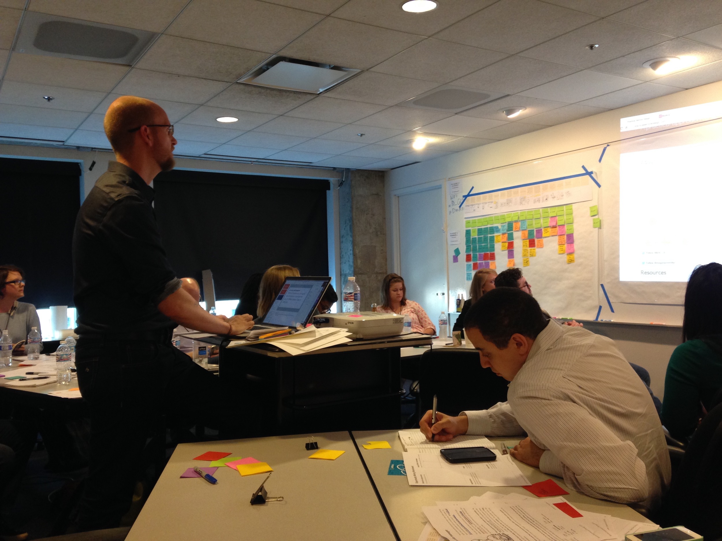
Erik Flowers walking us through a stellar workshop.

Erik Flowers walking us through a stellar workshop.

1) The speakers actually cared and spoke from the heart.

I don't know how else to expand on this but that every single speaker genuinely came to talk about what they had been experimenting with, what their struggles were, and how they were proceeding to do more service design work. Erik Flowers from Intuit and John Tuck from TrunkClub were some of the hilarious ones who you couldn't help but befriend, and Dianna Miller from Syracuse University anchored the hearts of every single audience member as she gave courage to designers in the room to share and extend their experiences. 
 

2) Attendees bonded over the challenges they faced and offered little case studies of their own to help others. 

You could almost feel the love and depth of care that lived in these stories while people began to share what they were going through in their organization. It was sort of therapeutic in a way and it even encouraged me to share the struggles of implementing design in a large corporation that, like many, just thought it was all about making it pretty. This was a safe place to share your struggles and also to proclaim what works. One of the biggest realizations for me was how necessary it was to come together and share these experiences - it brings back perspective and endurance to achieve the design goals I think every HCD designer cares about.
 

3) It was just large enough, the venue was enabling, and it was branded to be an experience that held together on its own. 

Sometimes I think the best service designers can be found in event planning industries. It is not an accident when they design seating a certain way, choose the kind of snacks people can select from, and how loud microphones are tuned to be. Putting on an event is no easy task and these guys nailed it. Everything was really seamless but simple. No super fancy things but just enough to make little moments feel special - like when they gave you your lanyard with a color coded dot on the workshop you selected. The amount of people there were just enough to make it diverse but not feel too overwhelming. To cap an audience count is design decision as well - but I'm sure you already knew that. :)

George Aye presenting the Chicago Public School Cafeteria project that I along with a group of designers helped design.

Service Design artifact from our workshop with M. Felix.

Service Design artifact from our workshop with M. Felix.

John Tuck from TrunkClub

Michael Felix leading us through a hypnotic workshop that was filled with meditation.

I really do feel as though I made some great relationships at this conference. I even reconnected with a professor of mine with whom I served on a project. It's strange how the world churns design circles and I'm really glad I made it out.

Tidying

On the flight from Copenhagen to Chicago, I read Marie Kondo's book, The Life-Changing Magic of Tidying Up: The Japanese Art of Decluttering and Organizing. I couldn't sleep at all during the flight so I plowed through the entire thing - and I'm so glad I did. 

I started my sabbatical by cleaning out my apartment but after reading this book, it seems as though I had only just dusted my shelves. Lady Marie is hilarious in the way she goes about talking about one's home and belongings, so for the pure joy of reading someone else's thoughts about belongings, this book is a must read.
 

"But when she pulled open her sock drawer, I could not suppress a gasp. It was full of potato-like lumps that rolled about. She had folded back the tops to form balls and tied her stockings tightly in the middle.[...] I pointed to the balled-up socks. 'Look at them carefully. This should be a time for them to rest. Do you really think they can get any rest like that?'"
Excerpt From: Marie Kondo. “The Life-Changing Magic of Tidying Up.”


Beyond the great representation of your belongings having a life of their own, Kondo does a great job of allowing you to follow through with her advice and thought process by encouraging you to ask yourself, "Does this bring me joy?" 

I documented some of my process but the biggest eye-opener for me was the realization of the sheer amount of things I possess in my little apartment.

All of the books I own in my apartment were laid out on my dining table. I love books with all my heart and this was the category that was the hardest for me. (Do you see my dining table bending a little? Ha.)

There were joyful + painful moments as well as lots of memories flooding through my thoughts while completing the process of tidying my apartment but after I completed it, I felt new, refreshed, and cleansed.

Total bags tossed into the trash? 15. I know. I couldn't believe it either.

One of the things that Lady Marie advises to do is to "[visualize] the ideal lifestyle you dream of." The one thing I had always wanted to do was to reorganize my bookshelf as a color gradient - because, why not?! Being a visual person, sometimes I won't remember the name of a book that I'm thinking of but I know the color and can see the cover in my mind. So, naturally, this way of organizing my books makes sense for me.

This process of tidying was probably one of the best experiences I've ever had. Kondo states in her book that it would also teach you to edit out other things in your life and I think that this is a true statement. 

As a UX designer, it already gives me a new perspective when it comes to choosing hierarchy of information, process flow, and editing material out. If you're in the industry, ask yourself, "Will it bring my user joy?"
 

UX Notes: Designing experiences should be done with the user in mind but what happens when you have multiple kinds of brain processes accessing the same material? Filters can be a point of contention with content managers and designers but having visual filters may be a feature that many have not yet experimented with but could provide another way for others to naturally find what they need. Hey Amazon - what if you had book cover color filters in your search process? I'll bet that your sales would go up (even if it's a little margin) and that you would have die hard, loyal fans.


Industry Specific

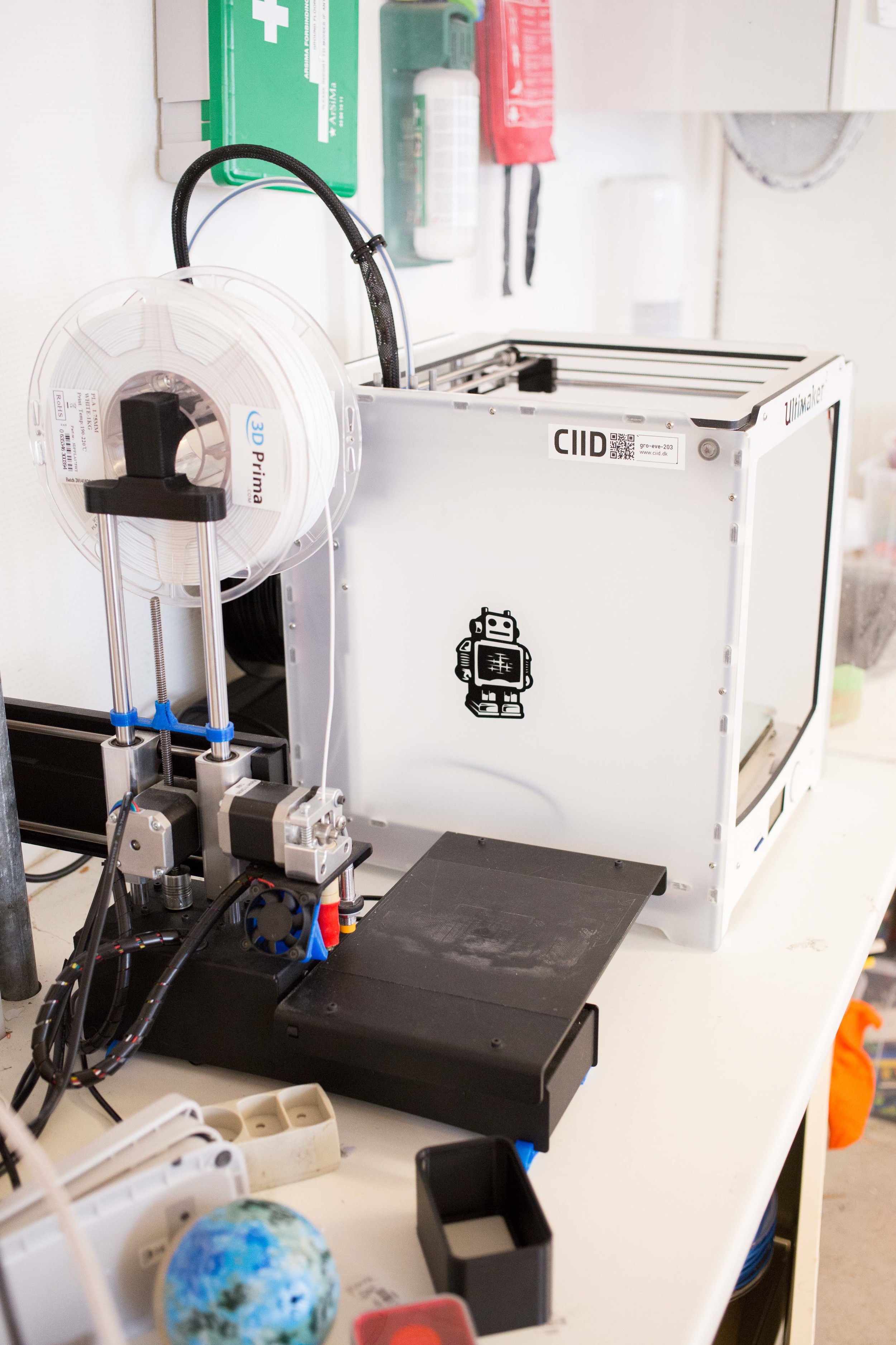
While I was writing my thesis in graduate school, I investigated a school called the Copenhagen Institute of Interaction Design (CIID). I wasn't able to visit during the few days I had in Copenhagen about 3 years ago but I made it a point to visit this time around. 

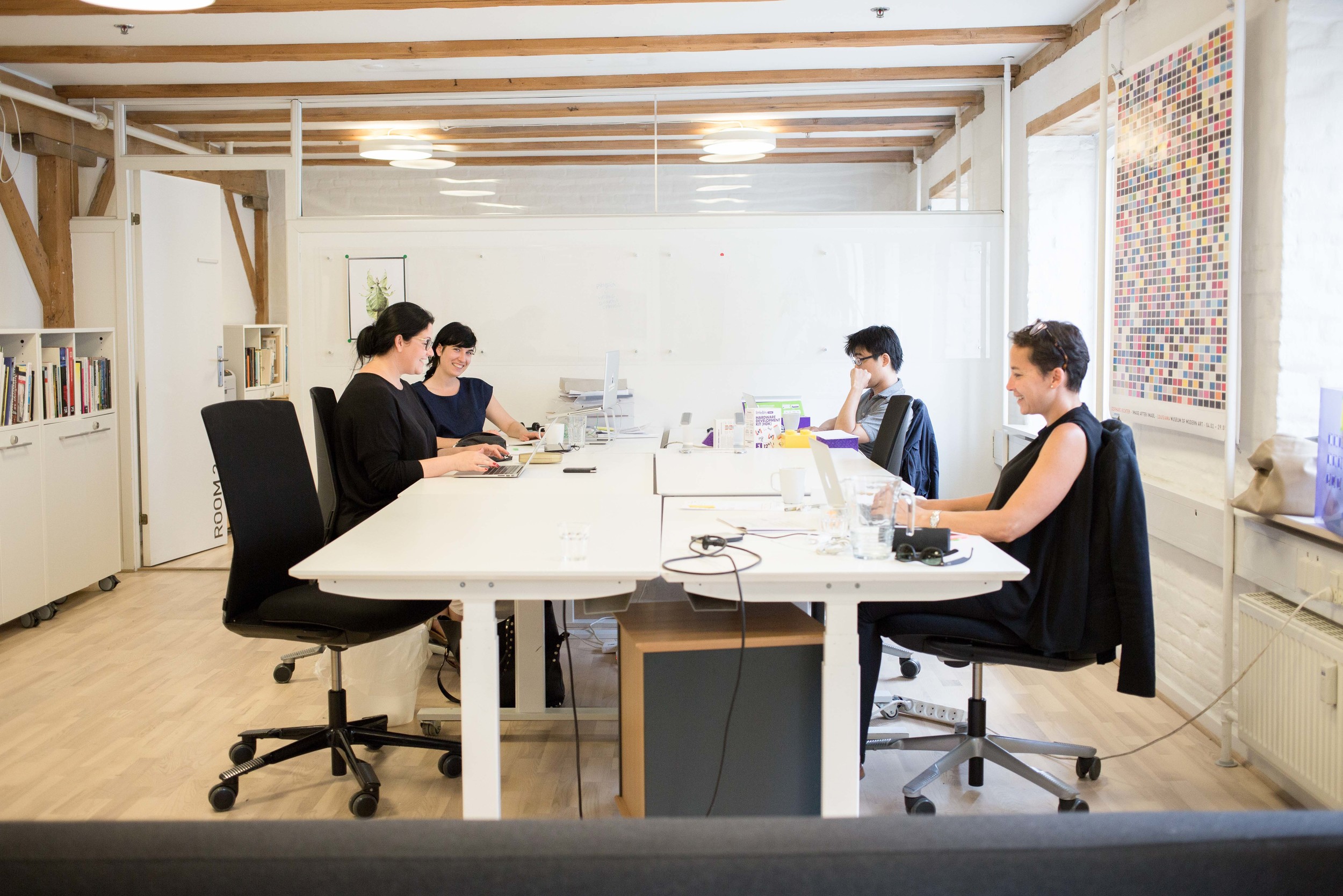
I had a friendly exchange with Alie Rose who basically runs the joint (Co-Founder and Head of Education) and met her at the CIID building. She was so pleasant to talk to, gave me a tour, and I ended up hanging out with her and her colleagues in their space for a little bit. Simona, the head of the program there, saw that I had a camera and asked if I could take some profile shots of her so I did. One thing led to another and I ended up there for almost 5 hours - would've been longer if I didn't have a dinner to go to. Basically, I fell in love with this place.

I have never been to a building that was so vertically charged with positive energy.

The only way that I can describe this is through food. You know when you have a croissant that has been folded over and over again with butter and dough, and you get the feeling that this little pastry in your hand is just charged with so much goodness? Yeah, that's what CIID feels like. 

Turns out that most of the students who come here are selected to be diverse in nationality. This move is absolutely intentional and really smart when it comes to creating an environment for innovation and collaboration. It is only through cultural differences and bringing brains together that have been wired differently will new ideas form and we will also progress to live more harmoniously in this world. 

One of the things that I love about the HCD industry is that it beckons in differences and not only welcomes them with open arms but is a crucial part of the formula when it comes to designing services, experiences, interactions, etc. Without this kind of dimension, it is quite possible that whatever solution or design is made may not be as encompassing or holistic. 

This is Simona Maschi who is the Co-Founder and CEO of CIID. Pretty much a rockstar but you can already tell by the photo.

This is Chris Downs with whom I had the privilege of spending some time with talking about lots of Interaction Design and notions about Service Design. He invited me to see some of his students pitch their ideas and I gladly accepted. So fun.

Pictured here is Simon Herzog who heads up the Nest component of CIID. Nest incubates new ideas and startups in the European sector and has a bunch of stellar experts and advisors who will help you along the way. 

The top floor of CIID is 'the Nest' and it really feels like a cozy, safe place to share and incubate a delicate idea.

I met great people and have since then met extensions of great people in Chicago who have been educated in this space. Their prototyping playground is imaginative, the architecture is fitting, and the energy is just really present and spot on. They have a great business model that includes education, consulting, and incubation for new ideas and I don't think it can get any better than that.

To read more on this program, go to CIID's site

UX Notes: Creating a physical space that reflects the kind of tone of work your organization provides is crucial to the survival of your employees and work culture. If you're wondering why something is not working in a project, take a look around you to see if there is something you can change. It might an environmental fix that you need.


More visual TREATS:

Food for... Eating.

When my brother and I went to Japan, we waited in line for sushi at the fish market for 4 hours. Yes. 4 hours. 

Needless to say, I love food. It has always been 'live to eat' and never the other way around. There are articles written out there about our current culture's obsession with food and the endless boards that exist on Pinterest which is everyone's not-so-guilty pleasure. So, I will gladly own up to the fact that, yes, I am a Millennial who is obsessed with food. 

Food lovers - you HAVE to go to Copenhagen. 

Your first thought might be, "Did you go to NOMA?!" The answer is no, I did not. 

I thought about going there and giving myself an insanely expensive treat but I decided that I wanted to keep that experience for later on in my life so that I have something to look forward to (and also to have an excuse to come back to Copenhagen). I laugh about this because it only shows how deep my adoration for food really is. I am literally planning when the peak of my dining experience should be but I have no shame in this arena and neither do my siblings.

Little did I know that some of the chefs who have trained at NOMA have exited and started restaurants of their own - one of them is Christian Puglisi and I basically played in his playground for a large portion of my time in Copenhagen.

If I'm going to go with this playground analogy, this man has the best sand box called Mirabelle, the most wonderful snack tables for recess called Manfreds, the best swing set with trained pushers called Relæ, and the coolest kids in town to hang out with. He also has one of those domes you can crawl over called Bæst but I unfortunately didn't get to try that gem. 

Mirabelle

The Airbnb I stayed at had a really great book of local eateries that they crafted themselves and I am forever indebted to my hosts for introducing me to this place. I think I came here a total of 4 times. Yes. I liked it that much. 

It was such a laid back place to do some work, to read, and to get some wonderful food. The people there are wonderful and there is a glass wall between the cafe and the bakers that make is so delightful to be creepy and stare at the process of all the goodies that come out of this place.

What I kept going back for:
1) The Sourdough Bread. This bread, ladies and gentlemen, is the best sourdough bread I have ever had. Ever. Ugh... I can't even write about it because it's so good. Let's just say that the day I was flying out of Copenhagen to come back to the states, I swung by to grab some to eat on the plane. It's that good. 

2) The Cortado. I used to be a barista in Los Angeles, CA and let me tell you how hard it is to steam milk. It's one of those things that people really take for granted and I did so myself until I had the task to create some on a daily basis. Mirabelle does an impeccable job and their espresso is fantastic as well. So. Good. 

3) The Plain Roman. This delightful treat is a thin focaccia like bread topped with sliced potatoes and leeks. There were other options available but this one takes the cake. It's so simple and clean but oh so delicious. 

4) The Croissant. Oh. My. ... This croissant is amazing. The Danish baker who creates this I found is a young woman (through my Instagram research - basically internet stalking) and she is famous in Denmark for producing these goodies. In their take away menu it reads, "Our croissants are very popular and are ripped off the shelves every morning. Come early or call ahead to make sure you get one," and it is so true. It was only the third time I came to Mirabelle that they had some available. 


Manfreds

I didn't feel like sitting at a restaurant but I did want some great food to take home so I figured it was my chance to try Manfreds. The reviews read that their beef tartare was impeccable. I'm actually really afraid of raw meat - I came out of my vegetarianism around 3 years ago but everything told me that I needed to try this dish. I ordered the beef tartare and the green dish of the day.

The hostess was really sweet and made sure I got some of Mirabelle's sourdough bread to accompany my meal. The. Best. Ever.

I ate both dishes in the comfort of my rented apartment and wow. It was delicious. Beef tartare is actually good and I think I may have been introduced to it in the best way possible. And with that bread? I don't think anything can go wrong with that bread.  

The green dish had olives in it and that's something that I still can't get around. I can detect those things in their smallest form in pizza so that shows how much I react to it. I wish I liked it though because the rest of the dish was spectacular and I can see how it would've been oh so wonderful if I enjoyed the enhancing flavor.


Relæ

The very last night I had in Copenhagen was originally planned for dinner with my new letterpress friend, Katrine. We had to cancel but I was miraculously called for an opportunity to eat at Relæ which I had been crossing my fingers for the entire trip. 

I wrote that if I were to compare Christian Puglisi's restaurants to a playground that this place would be the swing set with trained pushers and boy was it a blissful ride. All I had to do was sit down and enjoy the acclimation of slowly being pushed higher and higher and then being brought down gently with a joyous treat at the end.

Another addition to this dinner that made it a serendipitous experience was meeting a fellow diner to my right who was visiting from New York. He, too, was on a small sabbatical and it turns out that his girlfriend is in the same industry as me. We had much to talk about throughout the night and it was nice to share a meal with someone who was also about to embark on an adventure of new work and challenges ahead. 


Other delightful finds in Copenhagen include:

Grød

One of the strangest things I fell in love with in this magical city was oatmeal. Growing up, I didn't even know what oatmeal was until later on in elementary school, didn't taste it until high school, and even then I didn't like it. It always puzzled me how people could eat oatmeal and feel satisfied.

But Grød is so different. They stripped down the humble oatmeal and dressed it up with natural ingredients to enhance its flavor. One that surprised me was Icelandic yogurt which is very similar to greek yogurt. Wow.

Total times I tried different dishes here: 3. It's that good.


Höst

Another coveted place that is just as tough to get into as Relæ was Höst. I got a last minute reservation and got to spend some time eating delicious treats, meeting and talking wonderful servers, and reading my book. 

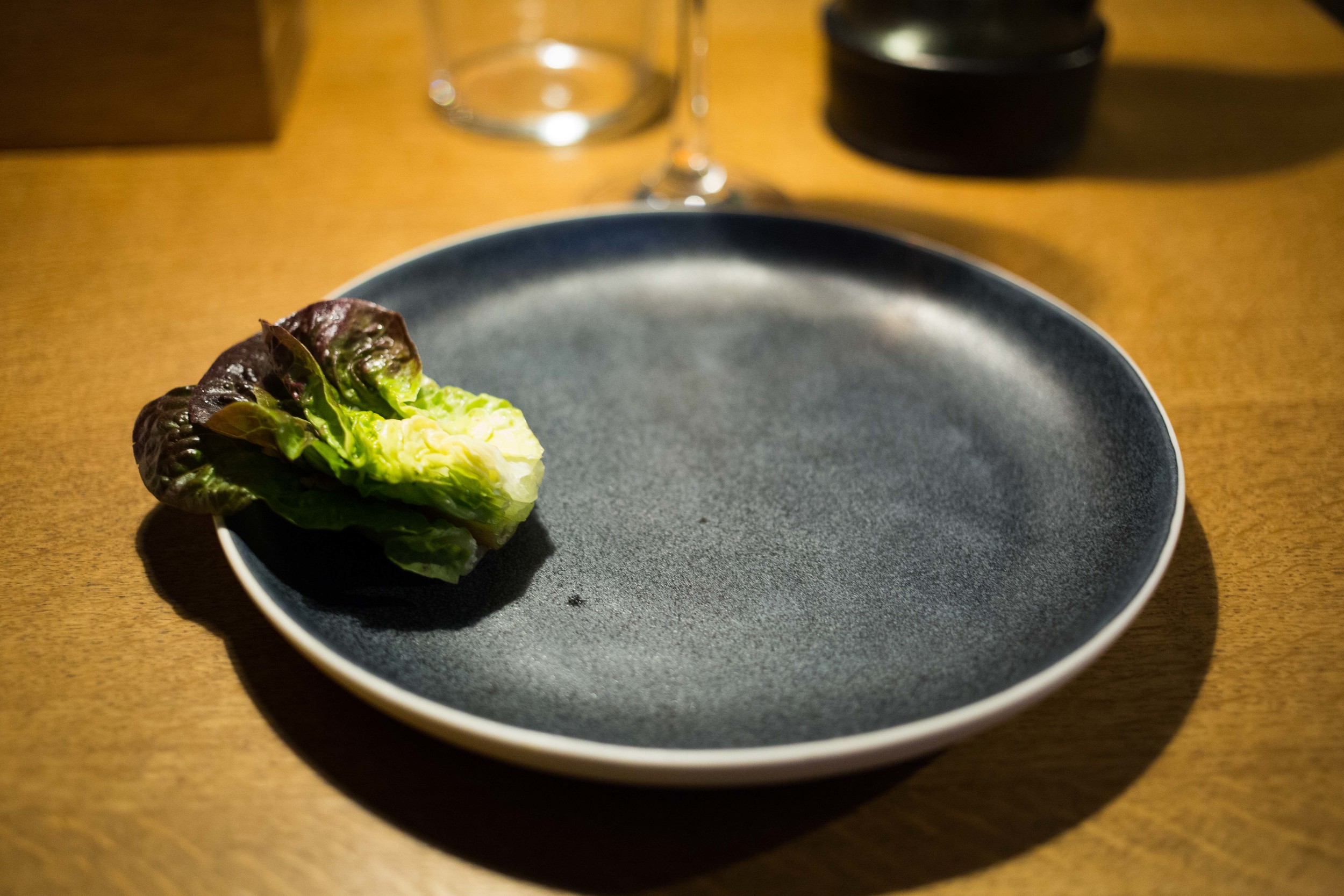
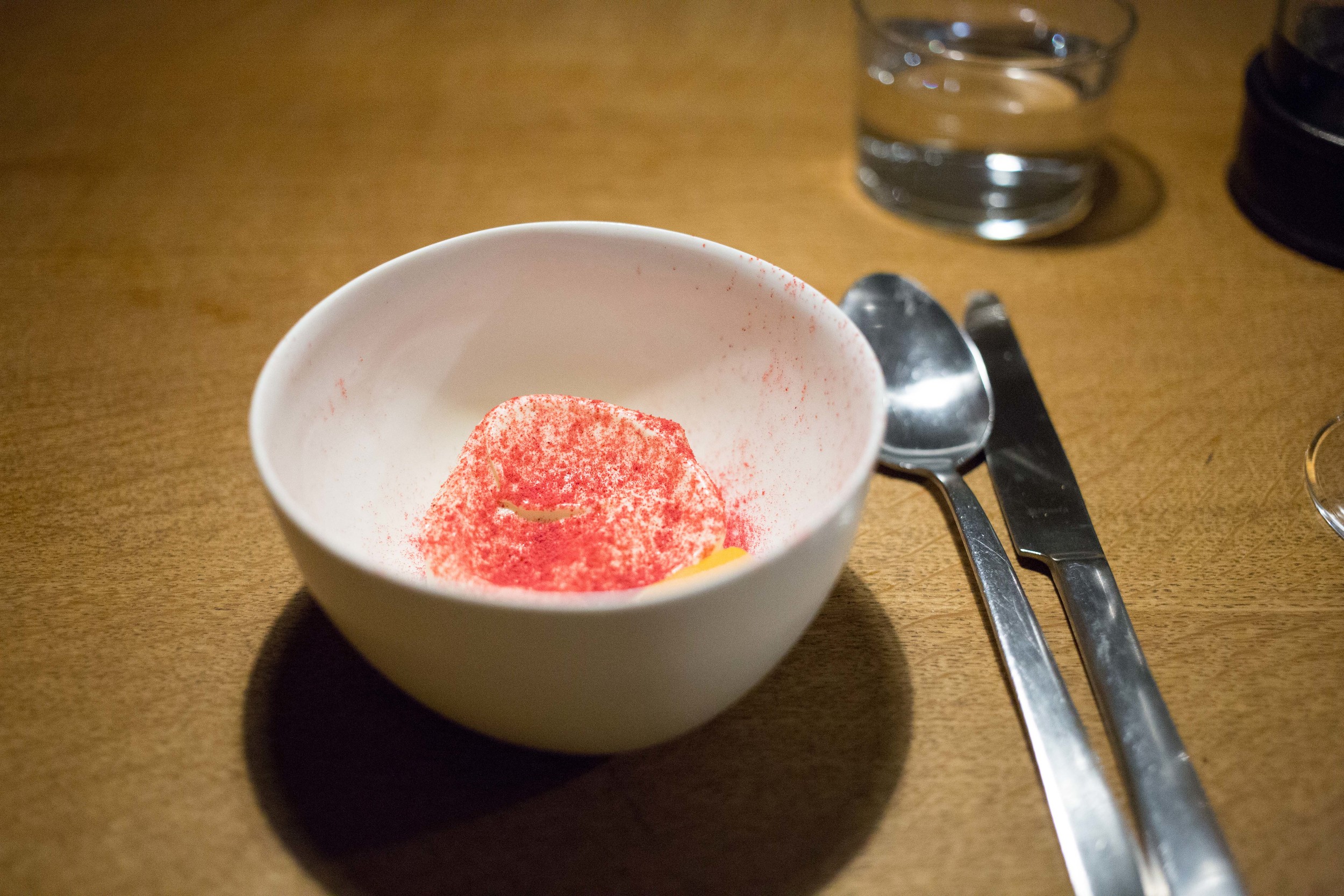
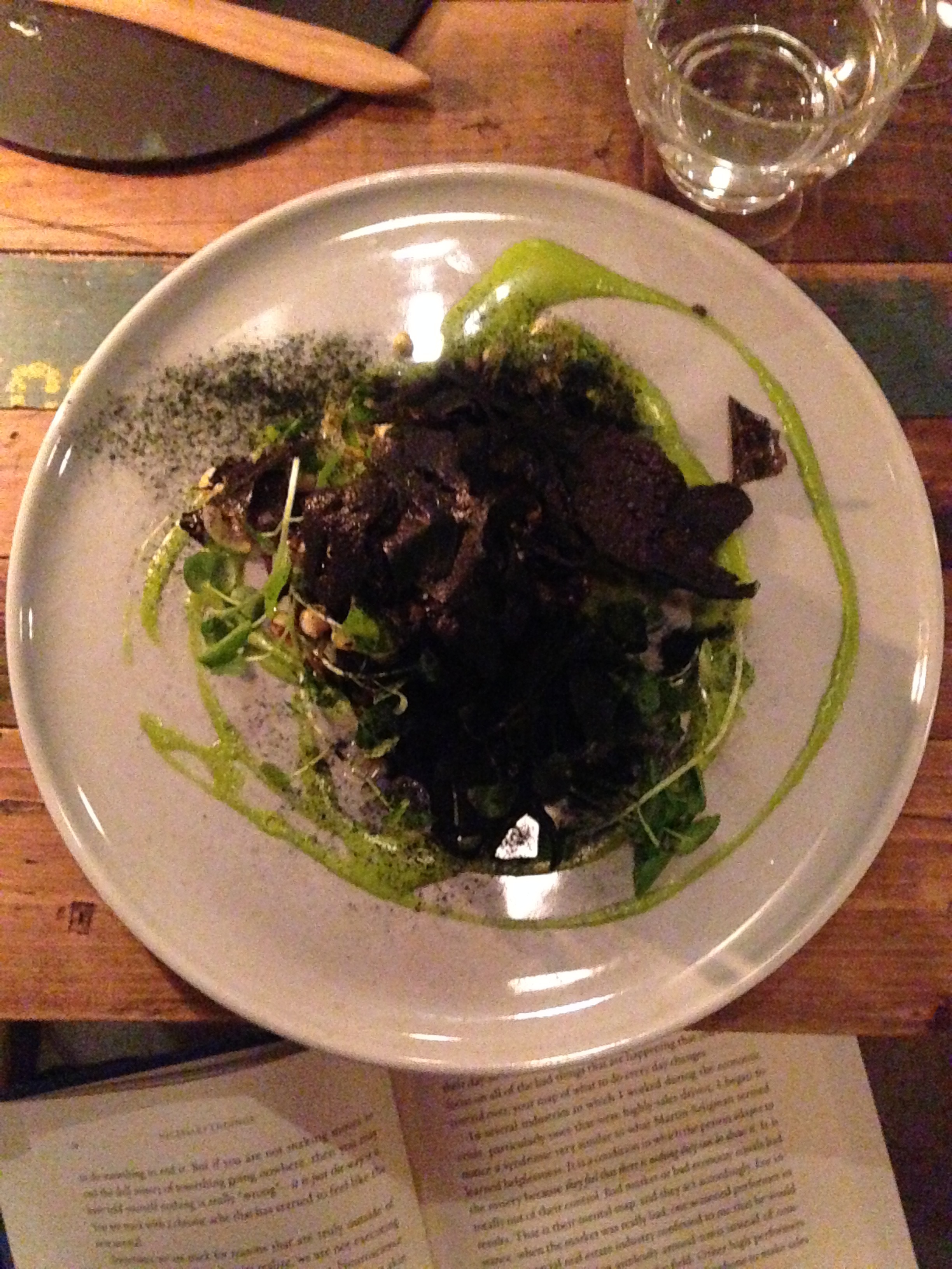
The people here were so wonderful and the food was fun and paired with great wine. Something to note about this restaurant is their attention to their dinnerware. Each piece was created and/or selected for the dish in mind which supports the dish to achieve its maximum potential.

The interior is also really magical and quaint and you can tell why they have won 3 international design awards. They were also named the world's best designed restaurant at the Restaurant & Bar Design Awards in 2014 so there's that.

Service Design Notes: During my dining experiences, a lot of the restaurants had a interesting way to welcome you to their table. They would bring out a little treat for you while you began to browse the menu to figure out what you wanted to eat. This is a great way to welcome users and also gives a way for restaurants to buy a little bit of time. It also makes the introduction memorable as opposed to the standard bread in a basket.

UX Notes: One of the most important things about design is that everything must breathe together in its function and form. I once interviewed a girl for a UX position who stated that "UI is not UX." As we talked more, I found out that she likes to cook and asked her if she just eats out of the pot or pan she cooked from or if she makes an effort to place it on a dish in a way that appealed to her. The answer was the latter. Having visuals support your hard work of research and functional design elevates your design to correctly communicate how you want your users to receive your product. Food and mobile screen? Not so different.